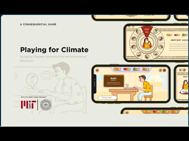

Making sustainable eating fast, fun & culturally familiar for Gen Z
80%
Faster Decision Time
Cut down the decision time from 10 min to 2 min
90%
User Engagement
in player experience (20% → 90%)
A
serious game that cuts decision time from 10 min to 2 min by fusing Pachisi & Roulette-style motion.
Playing for Climate is a mobile game that guides players through fast, low cognitive meal decisions balancing health, happiness, and carbon impact.
10k+
Educated
Gen Z students during inter halls hackathons
$30k
Secured
MIT–IITK funding for sustainable projects
Team
🎓 2 Mentors
🎨 1 Graphic Designer
🍲 1 Food Expert
📊 1 Data Analyst
🧑💻 2 Developers
My role
Empathize & Define
Ideate & Prototype
Test & Iterate
Impact Analysis
Duration
4 Months
This is the story of how we turned a dense educational tool into a fast, intuitive, culturally familiar mobile game ⬇️
Overview
🌍 We want to learn, but not through lectures.
We wanted to educate Gen Z about clean food and carbon emission impact in fast, game-like experience that turns complex food decisions into simple, repeatable actions without overwhelming them
⚠️Below video need your attention!
Let's look at the game mechanics we developed over the course of one year through constant iteration, research, and 8+ user testing sessions. It's a 2:15 minute video; feel free to play it at 1.5x or 2x.
Now that you understand the game idea, let's discuss the challenges we're facing.
Setting out to solve
🚨 Problem — “Current versions worked
The video shows many steps, but Meal selection was the most critical and complex part of the game.
plan a meal of 14-15 dishes
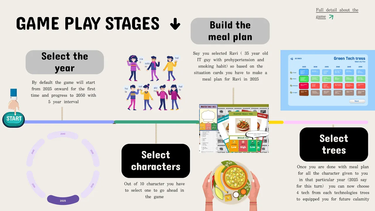
Meal plan
character selection


from a pool of 150+ food you have to make a
meal plan
Dry Fruits
Ragi Upma
Dry Figs
Year selection
2025
2030
2035
2040
2045
2050


select 3 from the pool of 72 cards
Trees selection

Moderate thali
Substituable pool
Board‑game prototype
✅ Reduced time to ~6 min
❌ Manual setup, not scalable

Selection Pool:
150+ dishes to choose
Planning meals:
plan 14-15 dishes from scratch
Spreadsheet -> Link 1 | Link 2
✅ Fast logic testing
❌ ~10 min per turn, high cognitive load
💻To reduce manual effort and improve engagement, we moved to a desktop prototype.
Desktop Prototype (3 min/turn)
After reviewing the desktop prototype, I synced with my developers, and together we built a fully workable version with complete game logic so we could test it directly with users ……scroll below for result we got

Moderate Thali:
Players start with a pre-made, balanced thali that is moderate in health, happiness, and carbon impact, instead of building a meal from scratch.
Moderate Thali:
Players start with a pre-made, balanced thali that is moderate in health, happiness, and carbon impact, instead of building a meal from scratch.
Substituted Pool:
We limited the pool to 20 dishes and allowed only substitutions,
✅Automated logic, ~3 min per turn (big win)
❌ Static, not mobile-first
Conclusion: The content worked ; the interaction model didn’t.
🚨 Key User Insights (25+ Gen Z Players)
I spoke with 25+ Gen Z players across age groups and reviewed their user-testing videos to understand how they played the game on laptop and board-game formats. I focused on meal selection behavior & shared these insights with my team to gain deeper clarity.
This led to key behavioral patterns that shaped how players made decisions in the game.
Meal selection felt complicated
Users froze when seeing 25+ cards at once Meal selection felt like deciphering spreadsheets
Interactions felt cliché
Players and my mentors pointed out that the interactions looked too similar to Civilization 6 and other Western strategy games. The meal, character, and tech-tree screens lacked a unique identity and didn’t feel culturally relevant for Gen Z.
Users didn’t want to open a laptop
Several players said, “I’ll play Elden Ring or GTA on my laptop, not a 2D educational game.” They clearly preferred a mobile-first experience that they could play anywhere, anytime.

One gamer summed it up
perfectly: “Can’t I have something where
I don’t have to scan lists and can actually
play it with two hands, anywhere and
anytime?”
Kunal, Game Development Club Coordinator
❓ Possible solution
After the field study and discussions with my team, I distilled everything into a few key “How might we” questions.
⚙️ How might we?
⌛
Clarify meal selection so players can make decisions faster and save time
🎮
Introduce novel, kinetic interactions that make the game more engaging
🤳
Let players play anywhere and anytime without friction
🧠
Less cognitive load
The solution
After the field visit and aligning the HMW statements, I brainstormed with my stakeholders and identified three main solution directions to explore before moving into design.
Solution 1
In Pursuit of Novel Interaction: Introducing Falling Bubble-Burst Meals
Moving past early concepts like Pachisi and Roulette, I identified a kinetic 'falling meal' interaction that truly clicked. I brought this concept to the food technologist and engineering team, and we worked together to solve the data-density challenge.
Moving past early concepts like Pachisi and Roulette, I identified a kinetic 'falling meal' interaction that truly clicked. I brought this concept to the food technologist and engineering team, and we worked together to solve the data-density challenge.


By replacing static grids with dynamic batches of 5–6 falling items, we successfully transformed a heavy database of 219+ foods into the fast, playful experience the team had been looking for.
By replacing static grids with dynamic batches of 5–6 falling items, we successfully transformed a heavy database of 219+ foods into the fast, playful experience the team had been looking for.
Solution 2
Rangoli/Mandala-Inspired Food Cards
Using circular food cards instead of rectangular ones created more space within categories and thalis, making the mobile screen less cluttered
Using circular food cards instead of rectangular ones created more space within categories and thalis, making the mobile screen less cluttered

The 0 to 1: Bringing interaction to the screen
Lets burst the unwanted meal from your thali
Iteration 1

Circular food falling cards
food categories are grouped as per data
Expert
suggestion
in between the game play
character
animation
Progress bars
Moderate thali
arrange in
3 subset
✅ Pros
✅ Gamified Selection: Users found the interaction fun and engaging.
✅ Progressive Disclosure: Successfully reduced visual clutter by revealing information only when needed
❌ Cons
❌ Longer CTA: Required 3 clicks just to add a dish
❌ Time Constraint Failure: The flow was too slow to select 10–12 items within the strict 2-minute limit.
Explore the prototype
Lets shorten the CTA : Meal Grouping with Smart Filters

Zero-Click Categorization: Selecting a Thali automatically sets 6 food categories, eliminating redundant clicks.

Smart Filters: Embedded Happiness, Health, and Carbon metrics streamline complex decision-making.
⚠️ Removing sub-categories showed 36 vegan dishes at once, which was too much for players.
💡 idea: So we displayed only the best dishes those good for health, happiness, and the climate.
Iteration 2: Winner🏅
Explore the prototype and experience the improvement
✅ Pros
Work well
❌ Cons
The design is slightly heavy
🏅The decision behind iteration 2
This design won because it streamlined the user flow. Merging food categories with the Thali selection eliminated redundant clicks, while the 'Smart Progress Bar' (containing all decision filters) decluttered the UI. The result was a faster, balanced experience that satisfied all our 'How Might We' goals.
All the screens
Once the interactions were finalized, I established a Design System and collaborated with the Graphic Designer to carefully curate the color palette and typography for the final interface.
User testing and impact
User testing to understand what users want to say, I tested the screens with users, and they loved the bubble falling and burst effect.
90% ⬆️ success rate
9/10 users successfully able to plan meals
10 min to 2 min 📉
Reduced time

💡 Impact we able to deliver
After prototype development, we successfully educated over 10,000 Gen Z individuals through a sustainability hackathon at IIT Kanpur and received $30,000 in funding from the MIT-IITK seed fund for sustainable projects in 2024.
🧠 Closing thought
This project taught me that transformation doesn’t come from assumptions or design brilliance it comes from genuinely listening to users and letting their behavior guide the solution.